
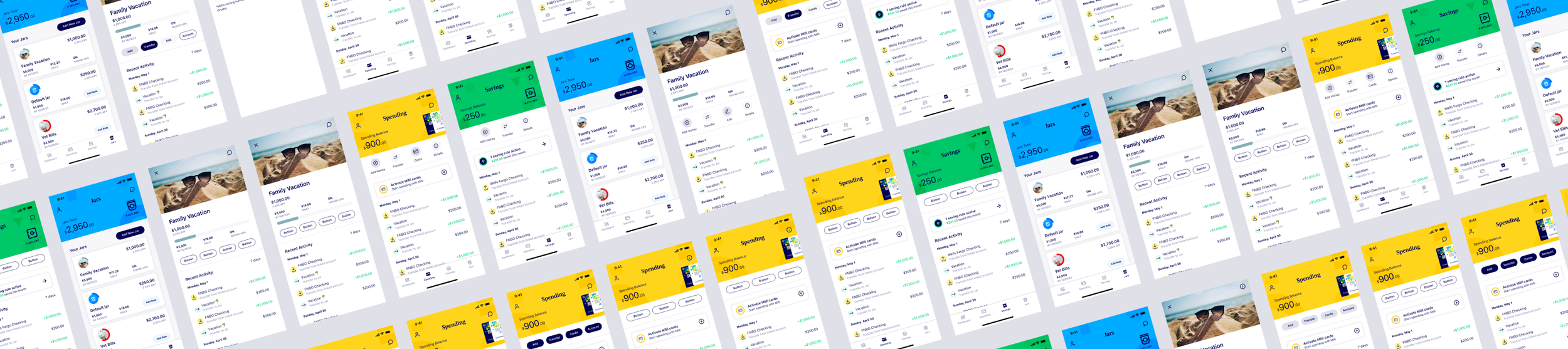
Milli Account landing pages
Project Overview
The goal of this project was to enhance the user experience (UX) across multiple app home pages by implementing consistent design elements, streamlining navigation, and adhering to established design standards. The primary objectives were:
De-clutter Home Pages: Remove unnecessary clutter and prioritize essential information and actions to create a clean and focused user interface.
Consistent Buttons and Actions: Implement a cohesive set of buttons and actions across all app home pages, ensuring a seamless and intuitive experience for users.
Maintain Design Standards: Align the visual elements and interactions with the company's design system, ensuring brand consistency and familiarity for users.
Information Architecture and User Flows
Based on the research findings, we restructured the information architecture and user flows for the app home pages. This involved:
Prioritizing essential features and actions based on user needs and usage patterns.
Streamlining navigation by consolidating related actions and reducing redundancies.
Defining clear pathways for users to access secondary features and settings.
Visual Design and Interaction Patterns
We collaborated closely with the design team to create a cohesive visual language and interaction patterns for the app home pages. This included:
Establishing a consistent button style guide, including sizes, colors, and placements.
Defining standard interaction patterns for common actions, such as adding items, filtering, and sorting.
Incorporating accessibility best practices to ensure a inclusive experience for all users.